Film School Project: Night of the Living Dead
Night of the Living Dead - Set Design Photos
The current course I'm taking at the time of this post is called Art Design and Location Shooting.
One of the first projects we did was to pick a script andshoot a storyboard the way you would do it if you were the director.
Part 1: Below you will find 2 scripts. Pick 1 (ONE) for this assignment
Option 1: Night of the Living Dead (1968)
Option 2: A Star is Born (1937)
Part 2: Review the indicated script scene and think about ONE interior location around your area that would work for this scene. (note that both scenes take place indoors)
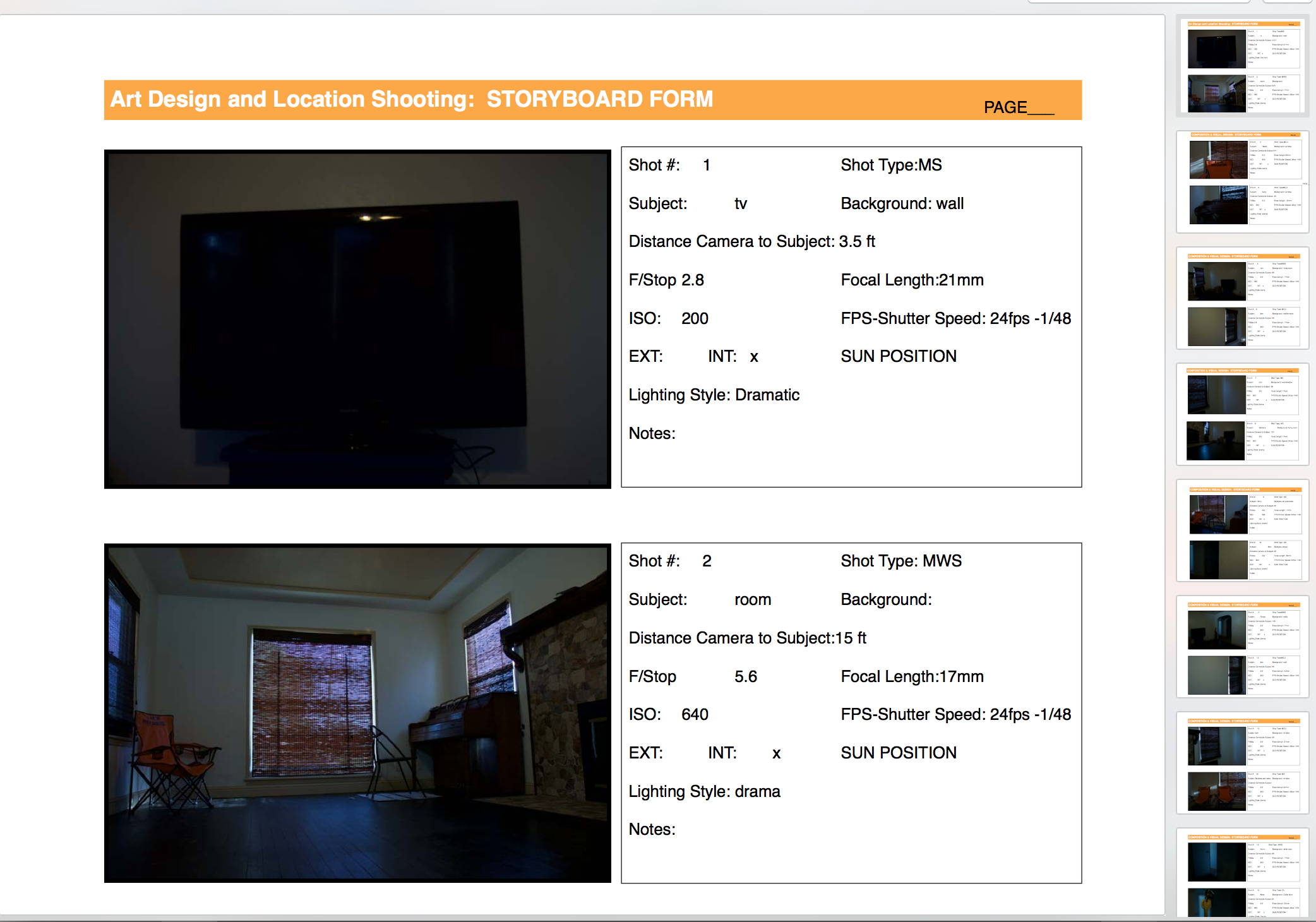
Part 3: Using the provided storyboard template, create a PHOTO story board detailing your chosen scene in ONE interior location
I had a hard time figuring out how I was going to do this in a short time and both scripts had about 5 actors in each scene.
We were told that we didn't have to use people and could put props in their place if we wanted to.
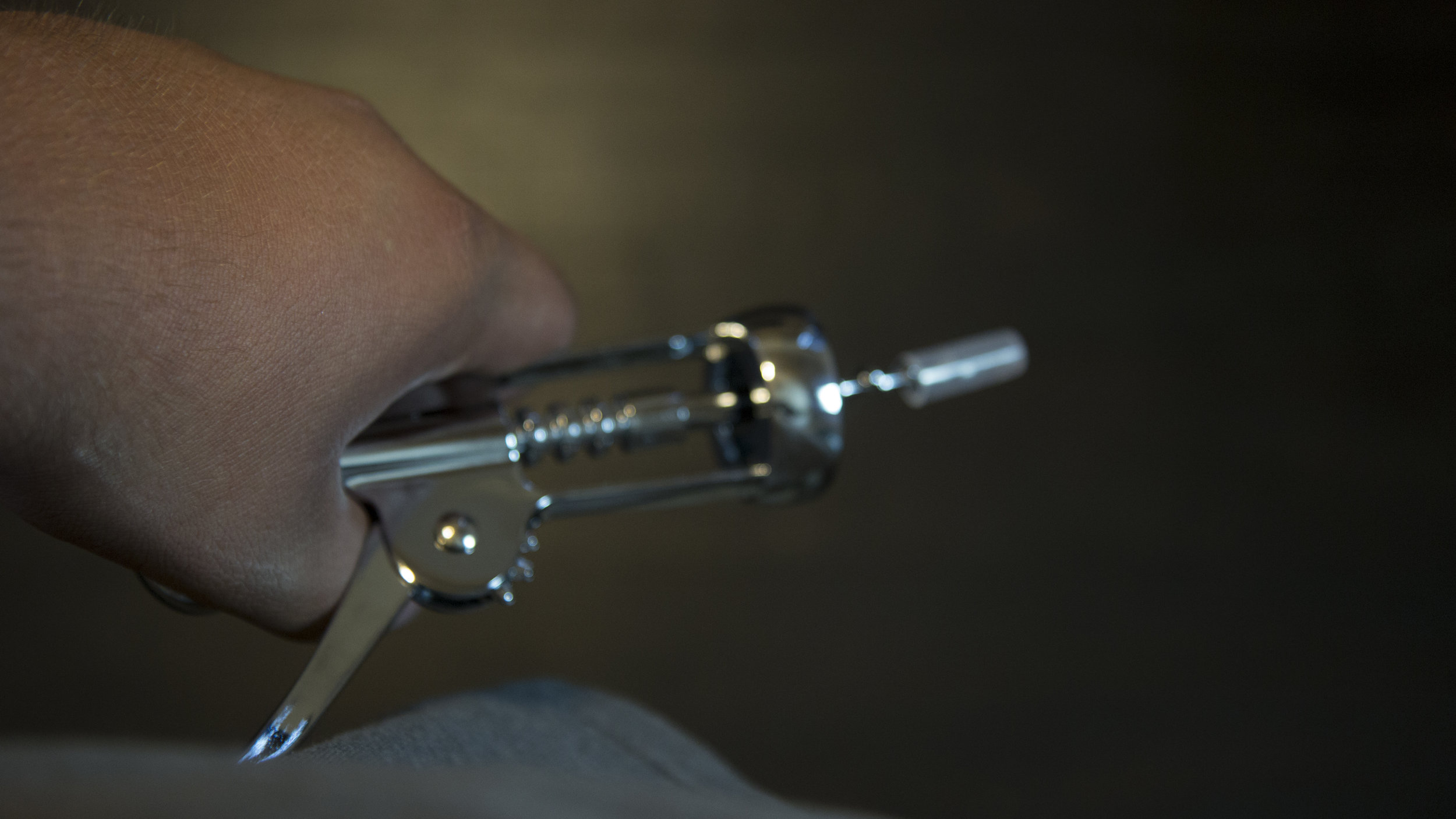
I really didn't want to set up cereal boxes with names as characters or stuffed animals in there so I shot photos as if someone was in the frame.
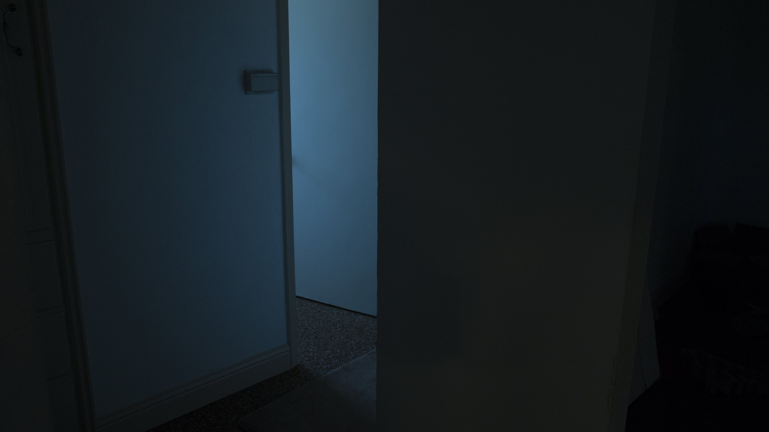
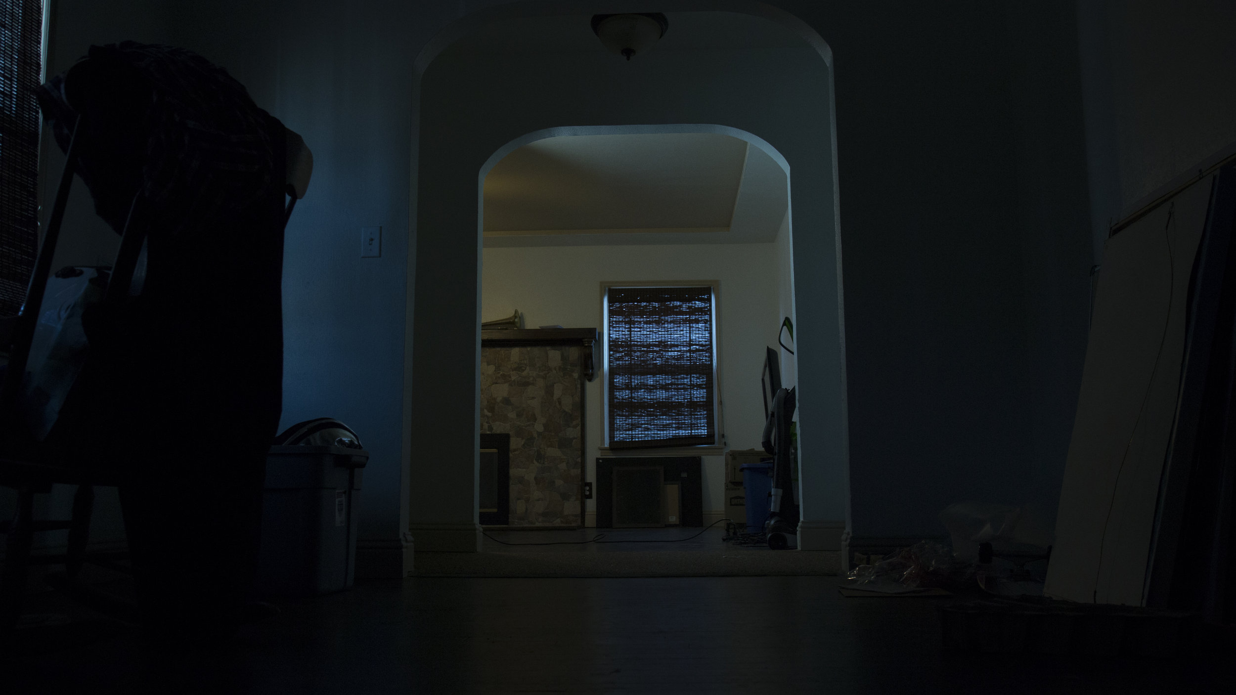
I chose to shoot my photos for Night of the Living dead. I really wanted something that I could shoot with dramatic lighting.
Here is the scene we were supposed to shoot.
watch 1:02:30-1:04:27
We were told not to stray from the script and it wasn't necessary to watch the film to complete this project.
If you read this part of the script you'll see its drastically different, there was a lot of the script cut out and moved around in the editing process.
The big difference I see between my shots and the film was that the films shots looked to be shot from a lot higher up and I generally shot a lot lower.
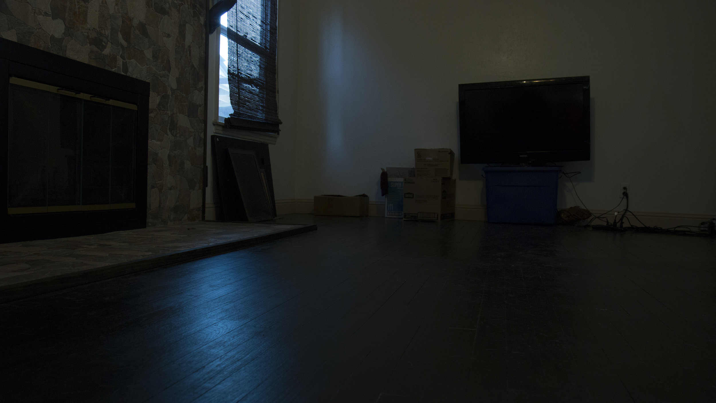
I chose to shoot in my living room. The script didn’t really dictate what room this was in, it could have been shot in any room that would have been on the first floor.
The scene really takes place in a single room and we really don’t end up seeing very much of the room.
For lighting I chose a time of day that would allow me to take advantage of practical lighting from the sun and I added a hard light that I bounced around on the ceiling to fill in any shadows and I moved that light around the room as needed.
I chose some basic props that could at least fit the shape of what was being referenced in the script.
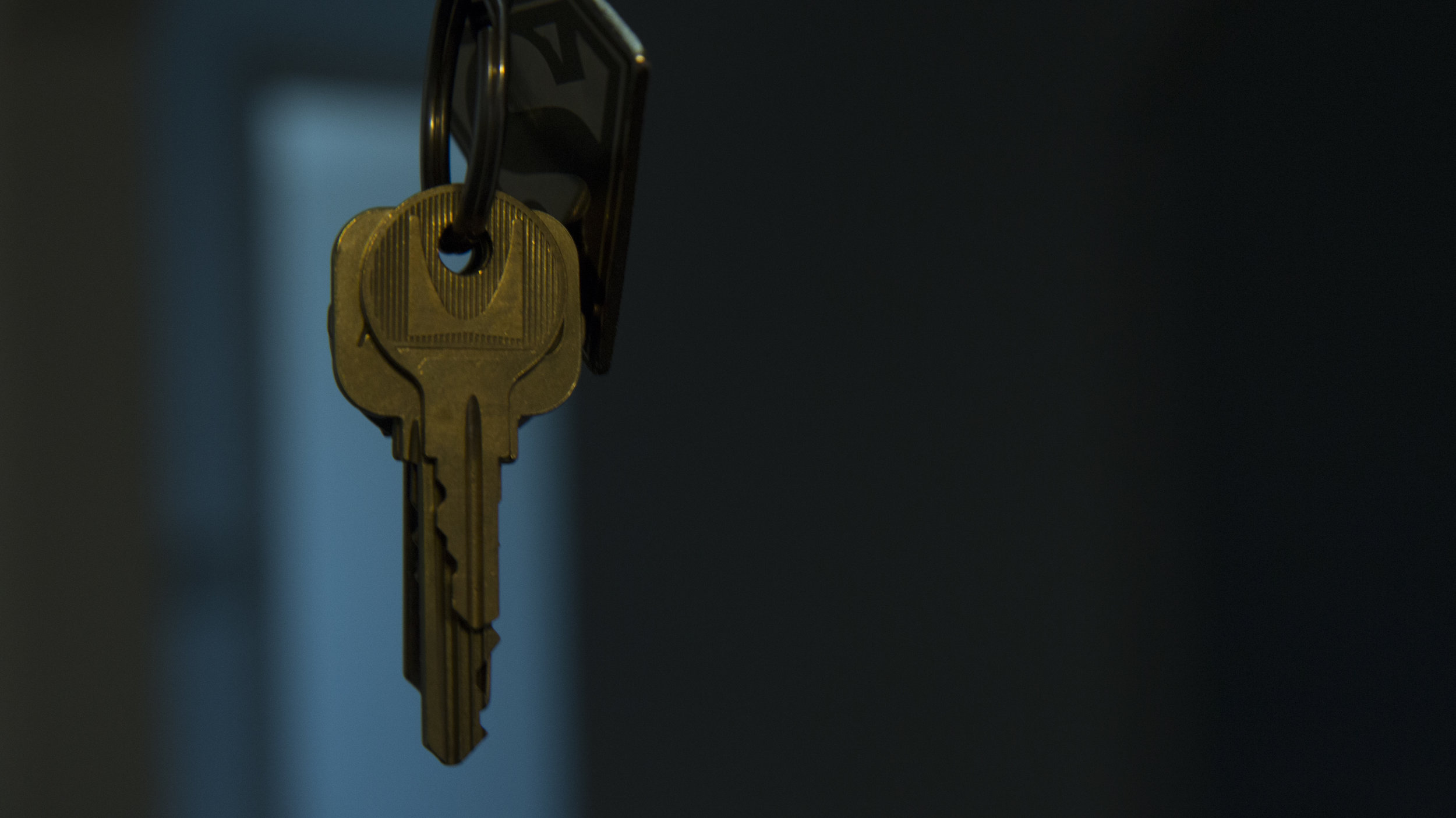
I used an umbrella for a crowbar, corkscrew for a gun, and just used keys for the ring of keys.
I felt that an apocalyptic film about zombies meant it was appropriate to have an empty cleared out room as if the group had found an abandoned house where the previous residents had taken everything with them.
For elements of art theory I feel that my images align with color, texture, and space.
I used color to show that all the light coming into the room from outside was blue and cold while all the indoor light was a warm orange yellow representing danger outside and safety inside.
For texture there are shots where you can see the grain on wood in the floor as well as the texture of the walls and keys when the lights hit them.
Finally for space I chose a couple wide shots that would really show the environment and spacial awareness to where people were in the scene.
I shot these photos in my living room. I did not do any post production on these photos I set my white balance to around 3100-3400 and that made the interior lights yellow and made the daylight a bright blue.
I really love the temperature color mixes in these photos. The colors are very close to complimentary and just pop.
I didn't include all the photos I took because they are pretty repetitive and not very interesting to look at.
We had to shoot a minimum of 28 total pictures, if you would like to see all the images here is a link to my StoryBoard File.
Don't forget to check outlay previous posts about lighting styles and and the recent short film I made!
Have you signed up for my emailing list yet?
Everyone who signs up will get exclusive content from projects that Im working on that goes out in my monthly newsletter Sign up below!


